Canvas Redesign
A to-do list and notifications students can rely on
- Role
- UX Research, Interaction Design
- Method
- User interviews, usability testing
- Platform
- Canvas LMS, mobile + desktop
- Focus
- Assignment tracking, notifications, GPA visibility
Canvas is the leading LMS in North America, yet in our experience and research it pushes students to work around it rather than with it.
Undergraduates with heavy course loads have little control over how Canvas organizes tasks and sends alerts. They lean on outside tools and workarounds, and still miss deadlines while drowning in notifications. This project finds where students hit friction day to day and proposes targeted redesigns.
Why it matters
Canvas serves more than 30 million students across 8,000+ institutions, and 38% of K–12 students in the US use it too. It's where courses, communication, coursework and grades live. Despite that reach, students keep separate to-do apps, ignore notifications, or check each course page by hand just to stay on top of deadlines.
Three pain points
A to-do list students can't trust
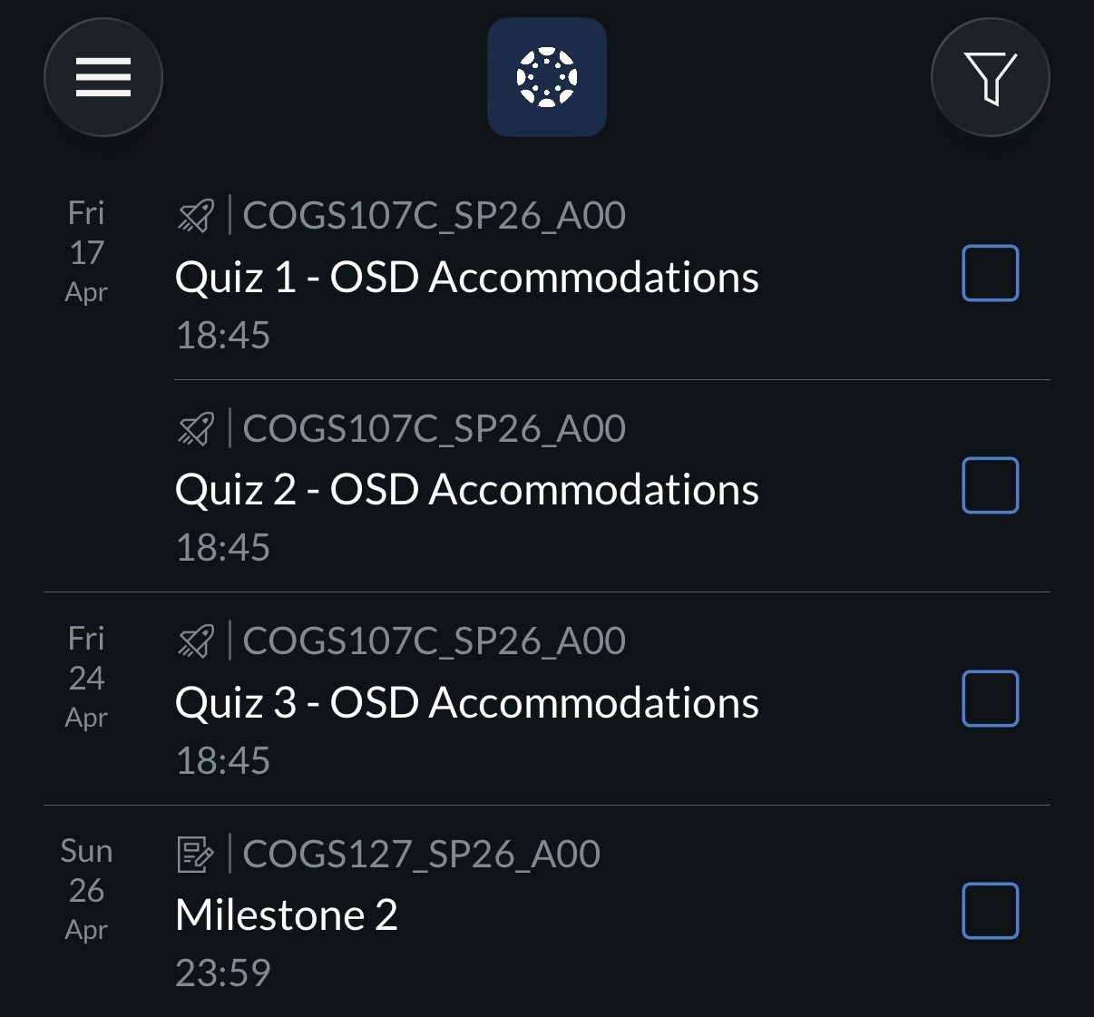
Students say Canvas's to-do list "doesn't ever show everything", so many keep a separate app or paper planner. That adds mental load and raises the risk of missed deadlines.
Notification overload
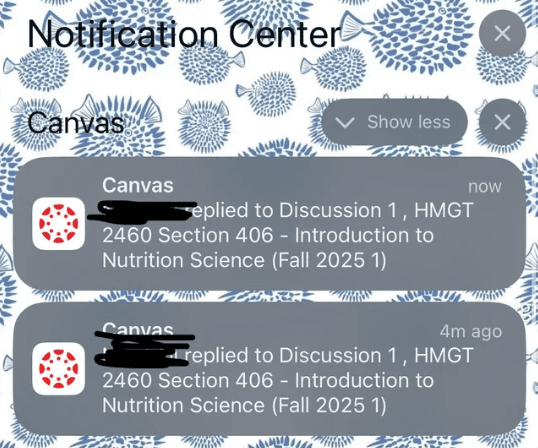
Students get an alert for every discussion reply in every course, with no way to prioritize on mobile. Desktop has per-course controls; the mobile app doesn't, so students either ignore everything or miss what matters.
No overall GPA view
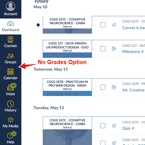
Canvas shows grades per course but no overall GPA or "what-if" calculator. Students calculate by hand or use third-party tools, which adds stress and takes away a sense of control.
What students told us
Notifications should only fire when something meaningful happens, not every time a due date gets adjusted.Participant 1 · 4th year · 6 courses · laptop, phone, tabletRelied on the to-do list but kept cross-checking the dashboard, and once missed an assignment that showed in one view but not the other. Found that mobile has only a global notification toggle, and used the Notes app to fill the gaps.
I thought I'd be able to edit notifications inside each course. When I finally found the settings, you can only change everything at once.Participant 2 · 4th year · 4 courses · laptop, phoneUsed both the Dashboard and Calendar to piece the week together, since neither was enough alone. Went through each course, then the overflow menu, then global settings, and never found per-course control.
You have to go through a maze to find due dates. A lot of courses are moving away from Canvas for that reason.Participant 3 · 4th year · 4 courses · mostly laptopWent course by course and often left Canvas for Gradescope or course websites. Tracked due dates from memory and had missed assignments. Wanted to filter alerts by type (grades, assignments, announcements) rather than more volume controls.
See the week at a glance
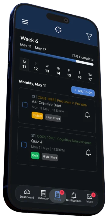
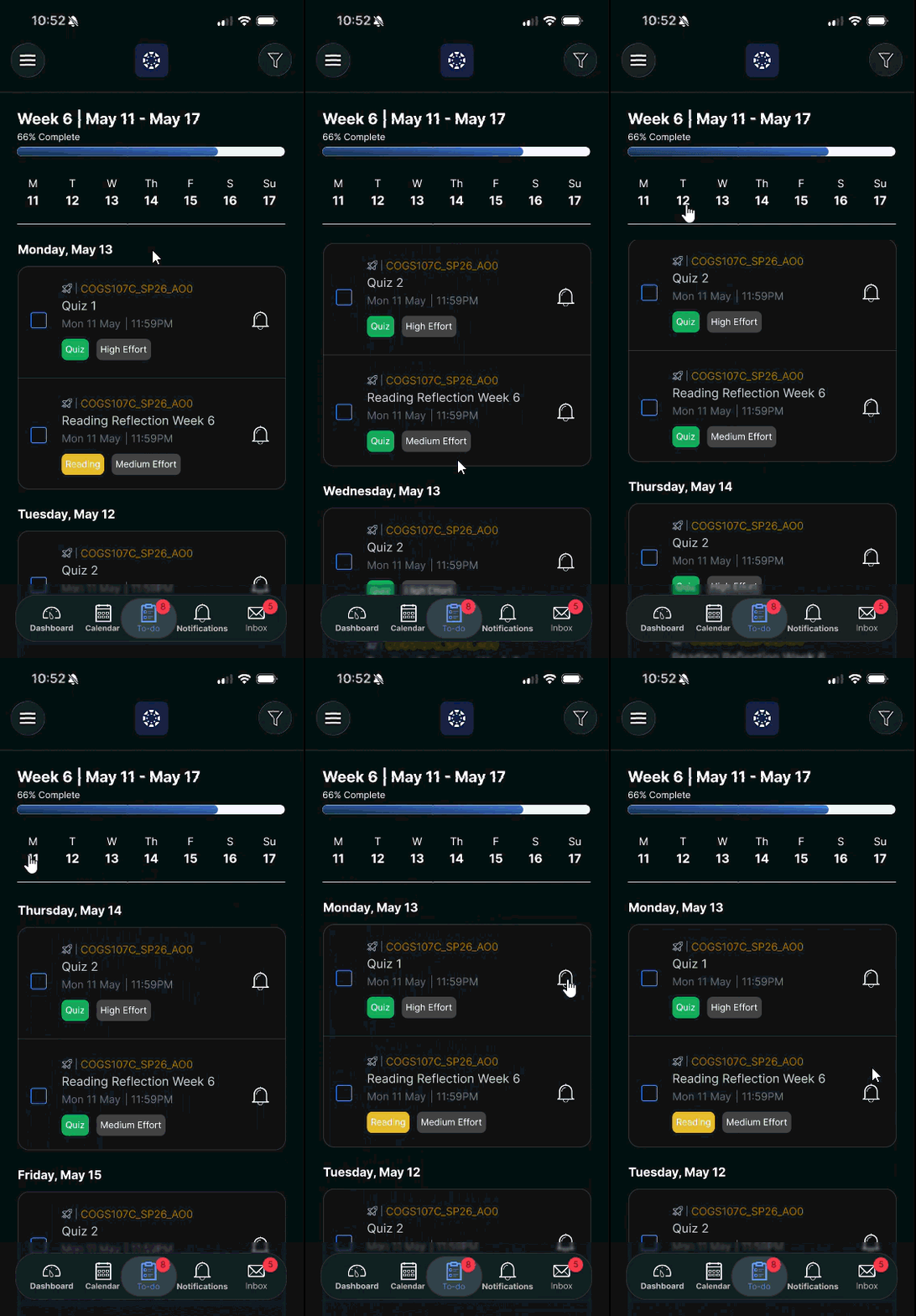
The to-do list now opens with a weekly progress bar, shows effort badges (High / Medium) on each assignment card, and puts a reminder bell right on the card.
Progress you can see
Students never knew how much work was left. The progress bar shows weekly completion at a glance.
One-tap reminders
Setting a reminder used to mean opening the assignment. With the bell on the card, it's a single tap without losing your place.
Help prioritizing
Canvas never showed how demanding a task is, but students said effort decides what they do first. The badges make that call faster.
Alerts that make sense
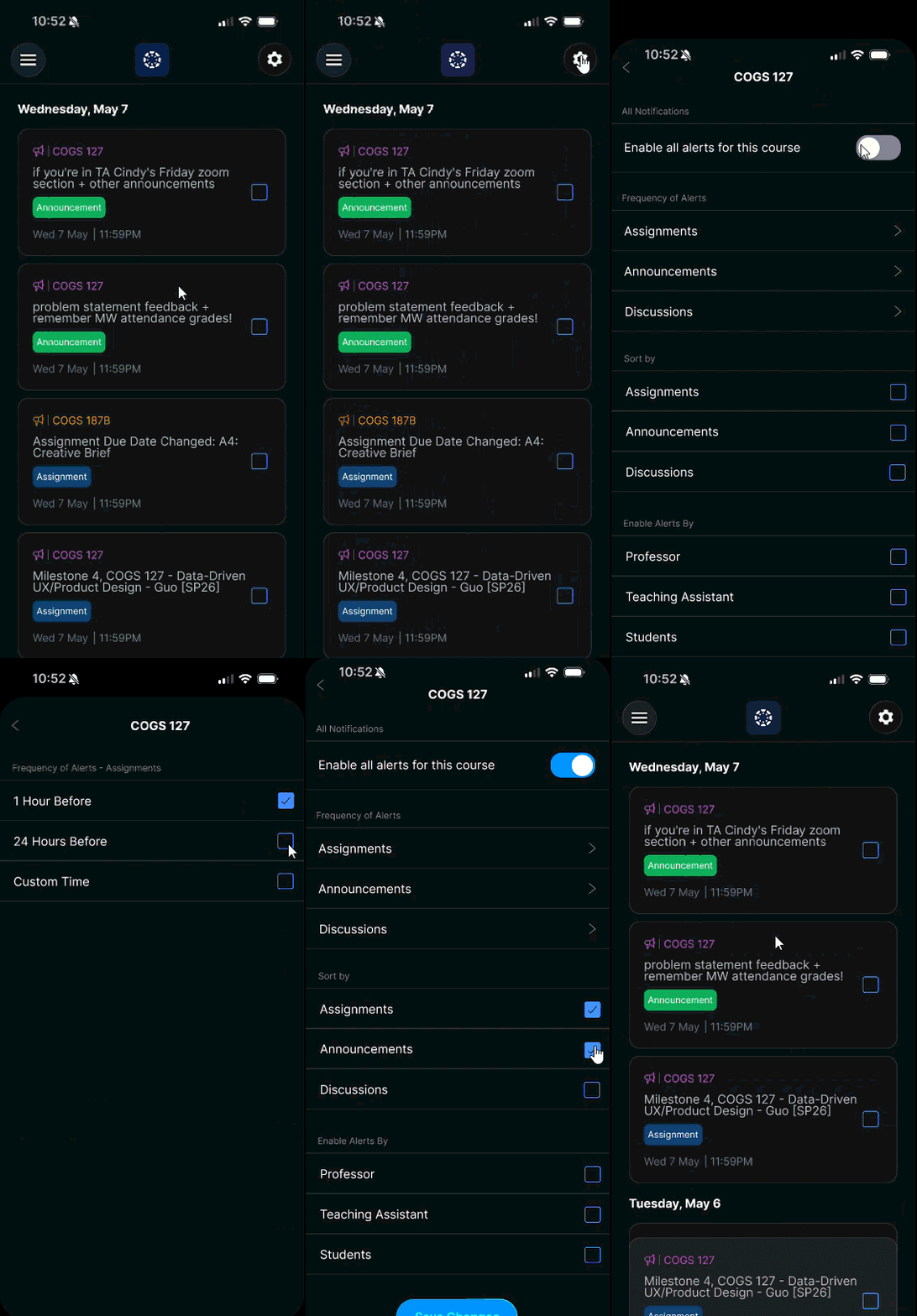
Notifications are grouped by date, and readable course names replace raw section codes ("COGS 127" instead of "COGS127_SP26_A00"). A master toggle on each course's Manage Alerts page turns all of its notifications on or off in one tap, and "Reset to Default" is now a secondary button so it's harder to hit by accident.
Less overload
Students called the unfiltered feed overwhelming. Grouping by date adds structure and makes it easier to scan.
Controls where students look
In testing, participants looked for per-course controls inside each course, so the toggle now lives there.
Fewer accidental resets
"Save Changes" and "Reset to Default" used to look the same, making destructive resets too easy to trigger.
Testing Design A against Design B
The bar is really helpful. I was always guessing how much I had left; seeing a percentage makes it feel more manageable.Participant 1 · 4th year · 4 courses · laptop, phonePreferred Design A's horizontal progress bar and inline reminder bell, but used Design B's day-by-day filter through all seven days. Found long course codes a constant snag, and wanted Design A with B's day filter added.
When I tap Wednesday it only shows me Wednesday's stuff? Yes, that's exactly what I'd want.Participant 2 · 4th year · 6 courses · laptop, phone, tabletPreferred Design B: the day filter cut overwhelm and the circular progress felt more motivating. Wanted a course filter neither design had, and found B's reminder bell harder to spot inside the card.
I like that this design makes saving changes clearer, instead of assuming the back button saves them.Participant 3 · 4th year · 4 courses · laptop, phoneTested notifications only and preferred Design B throughout: grouping by date, timestamps, and checking off alerts once read. Suggested combining the to-do list and notifications to cut the friction between them.
Consistency, readability, control
Canvas works around its users instead of with them, and students have quietly accepted that as normal. This project showed the bar for improvement doesn't have to be high: most of what participants asked for wasn't a new feature, but consistency, readability and control.
When students can trust that assignments appear where they expect, set a reminder without leaving their list, and silence a course in one tap, they stop compensating for the system and start relying on it.