Spotify Redesign
Rethinking discovery on the mobile artist page
- Role
- UX Research, Interaction Design
- Method
- Moderated usability testing
- Platform
- Spotify mobile app
- Tools
- Figma
Spotify is part of daily student life, yet its artist page makes it surprisingly hard to explore an artist's full catalog.
This project set out to find exactly where listeners get lost, then redesign the artist page to reduce friction and make discovery easier.
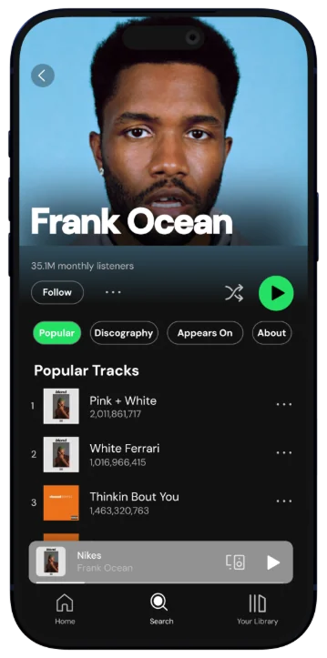
One long scroll, no structure
The mobile artist page stacks every type of content into one continuous feed. There's no navigation: popular tracks, podcasts and similar artists all share the same scroll. It looks clean at a glance, but that simplicity hides real friction as soon as you want more than the top five songs.
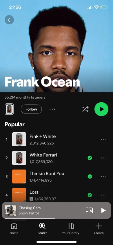
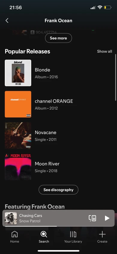
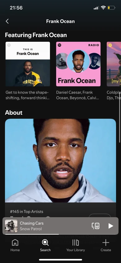
What we set out to learn
Featured tracks are invisible
"Appears On" sat at the very bottom of a long page. All four participants either missed it or only found it thanks to years of using the app. If users can't find it, it might as well not exist.
No single view of every track
Finding older songs meant opening albums one by one. There was no way to see an artist's full catalog in one place, so discovery came down to trial and error.
A cluttered vertical scroll
Albums, singles, podcasts, recommendations and similar artists shared one dense feed with no clear hierarchy. Participants overshot content and kept scrolling back.
How other apps handle it

Apple Music
- Strengths
- Clearly labeled sections, a visible "Appears On", and sorting by date or popularity, all missing from Spotify on mobile.
- Weaknesses
- Feels less personal, with fewer ways to discover new music.
- What we took
- Inspired our tab structure and the more prominent "Appears On".
YouTube Music
- Strengths
- Top and featured songs show immediately; singles, EPs and albums are neatly separated, with a music vs. live filter.
- Weaknesses
- The video-heavy layout can overwhelm music-only browsing.
- What we took
- Confirmed the value of showing top content first and ordering the catalog by date.
SoundCloud
- Strengths
- An artist summary with a song count, and a release feed that makes older tracks easy to spot.
- Weaknesses
- Disorganized and hard to navigate; often called frustrating.
- What we took
- Showed us what to avoid, while confirming the value of an About section.
Four changes, each grounded in research
Tabs for each task
Four labeled tabs (Popular, Discography, Appears On and About) replace the single scroll, so listeners jump straight to what they need.
View all tracks
One button shows the artist's whole catalog in a single chronological list. No more opening albums one by one to find older songs.
"Appears On" as a main tab
Features and collaborations move from the bottom of the page to their own tab, as easy to reach as the top songs.
Less vertical clutter
Music is separated from podcasts, merch and similar artists. Each tab shows only what it promises, with no interruptions mid-scroll.
A structured artist page
The redesign focuses on the mobile artist page. The single feed becomes a tab layout that organizes content into four clear sections, each reachable from the top of the page.

Testing both redesigns against the original
Four new participants, none of whom had seen the prototypes, completed the same tasks on three versions: the original, Redesign A and Redesign B. The prototypes weren't fully functional, so the task changed from "add songs to a playlist" to "find specific songs", which tested navigation and discoverability directly.
Faster task completion
Participants found songs noticeably faster in both redesigns. Tabs removed the aimless scrolling that slowed them down in the original.
"Appears On" found
In Round 1 one participant never found it. In Round 2 everyone found featured tracks quickly, and several described it as a "new feature", even though it was always there.
Less mental effort
Participants spent less time getting oriented and navigated with more confidence, even while first exploring the tabs.
Unanimous preference
All four chose the redesign when asked which version Spotify should use, calling it "cleaner", "more organized" and "finally makes sense".
What I'm taking forward
Visibility is usability
"Appears On" felt brand new to Round 2 participants, though it existed all along. A hidden feature and a missing feature are effectively the same; placement and labeling decide whether something gets used.
Success means less effort, not new visuals
Participants praised fewer taps, clearer paths and less scrolling, not the look. The redesign changed how Spotify thinks more than how it looks.
Prototype fidelity shapes your insights
Because participants couldn't actually add songs, we got strong navigation data but little on error handling or playlist building. A higher-fidelity prototype would have surfaced those issues.
Familiarity can hide usability problems
Experienced users finished tasks the design made hard because they'd learned to work around it. It's worth watching for moments when users succeed for the wrong reasons.